BagID - Increase Sales
When the airlines announced they would start increasing their number of flights after the Covid lockdown, BagID wanted to increase their sales and appear new and fresh.
The main challenge for this project was to make something complicated look easy and feel like a necessity.
The website is built in WordPress and uses Shopify as checkout and backend.
Finding the Issue
BagID had good traffic to their website, but sales were low. To find out why I analyzed the traffic and performed user interviews and contextual inquiries.
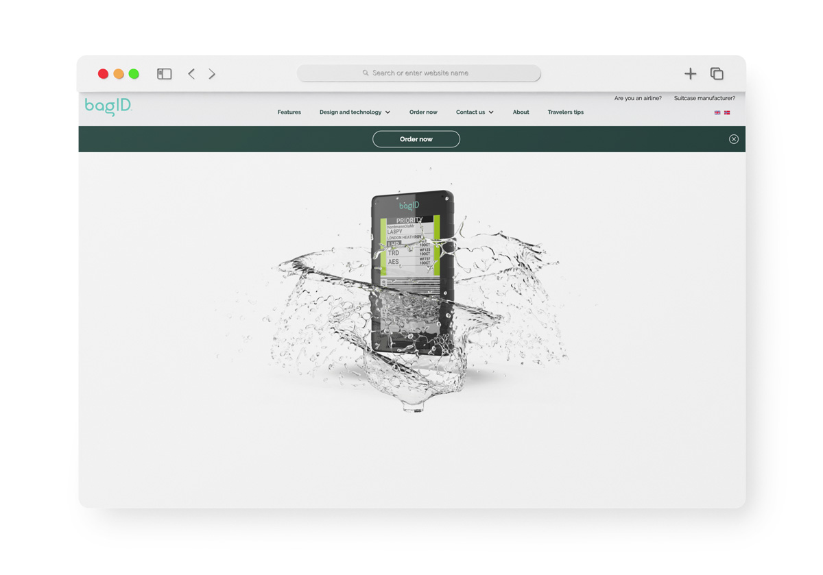
This research uncovered interesting behavior on the website, and user testing revealed some surprises on user wants, needs, and pain points in the current website’s user journey.
Analyzing Website Traffic
I started by analyzing the website traffic in Google Analytics. It had a good amount of visitors, a low bounce rate, and high session durations.
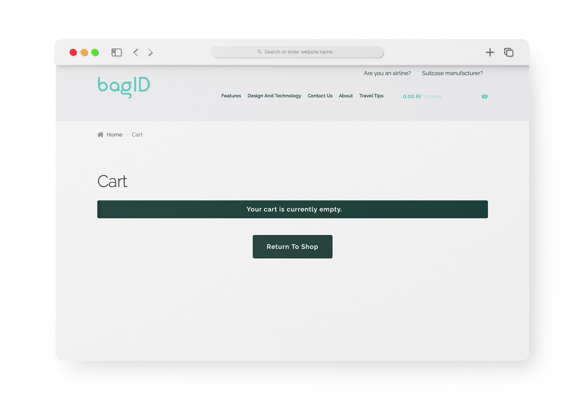
Visitors spent time on several different pages, but then they left. They didn’t follow any clear user journey, and no one added products to the cart.
User Interviews
To learn more about people’s wants, needs, and pain points during travel, I interviewed a large group of people who travelled regularly – some of them with valuable cargo.
I also wanted to find out what they found compelling about BagID, and which expectations they had for a digital bag tag.
Most of the interviewees wanted a faster check-in process and thought the possibility to check in luggage from home was a great feature.
They were also very compelled by the idea of tracking the luggage on their phone.
To consider buying a device, they wanted to know more about:
- Battery life - they wonder if it will last through the whole journey.
- Robustness - they are worried it will break.
- How it is attached - those with valuable luggage were concerned the bag tag might fall off.
- How to use it - many were concerned it might be very advanced.
"I want to hear from customers in the same situation as me and how it works for them. That has a big impact on whether I want to buy it or not."
"Before buying this product, I would have to be a little familiar with it. If I had seen it in social media, in commercials, or on posters, or maybe Norwegian (the airline) recommended it, there’s a bigger chance I’d consider buying it."
Contextual Inquiries
To learn more about the current website, I conducted contextual inquiries.
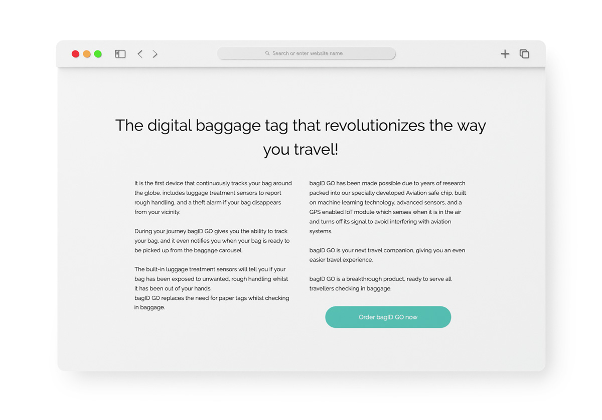
The most striking discovery was that new users didn’t understand what the product was. Those who guessed what it was, weren’t sure they had guessed correctly and kept looking for info.
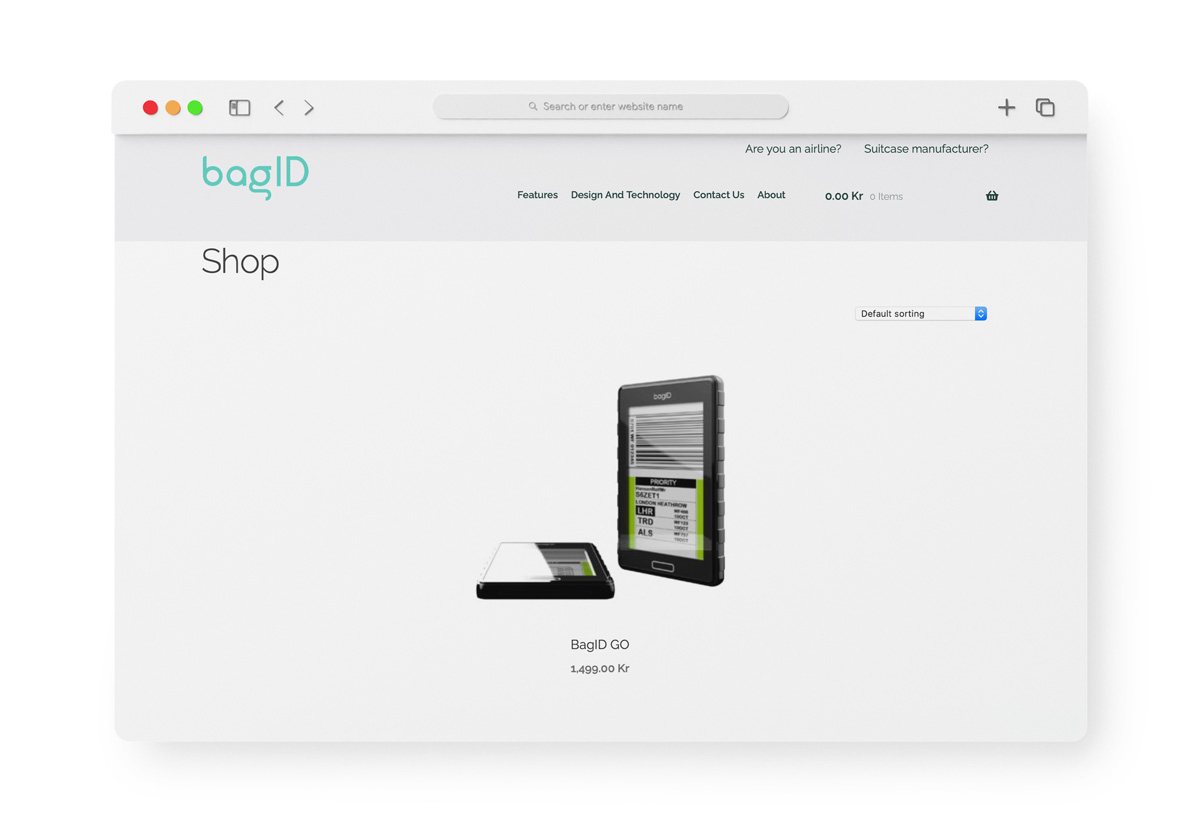
Since this is a new product, many of the test users tried to make it fit with something they already knew. Several users thought it was a waterproof case for flight tags, and some thought it was a new smartphone.
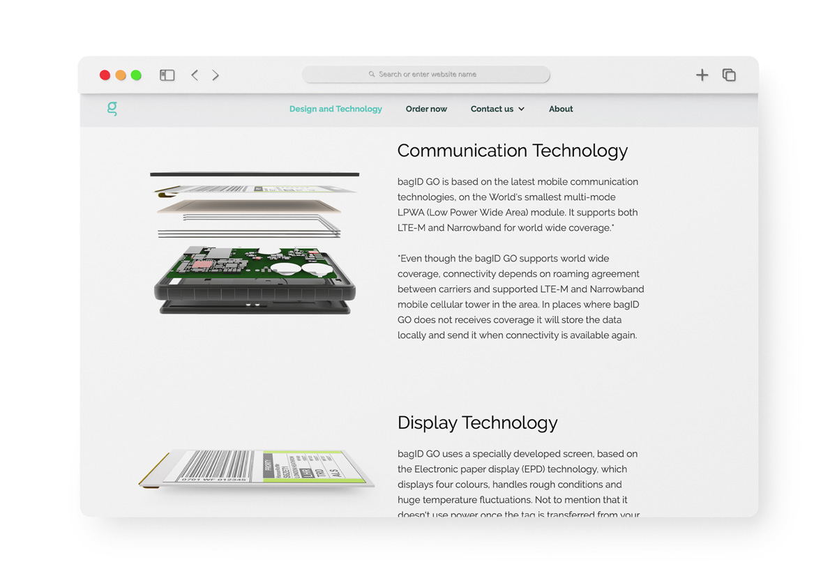
The users did not see how the product was relevant to them, and they were not inspired to use a BagID bag tag on their journey.
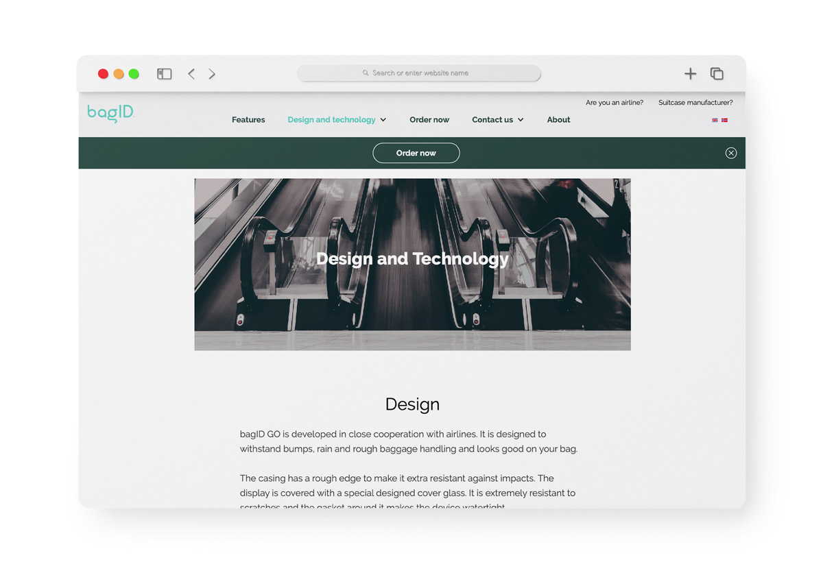
Many users struggled to find information about the bag tag on the product page, and they didn’t manage to find answers to their questions.
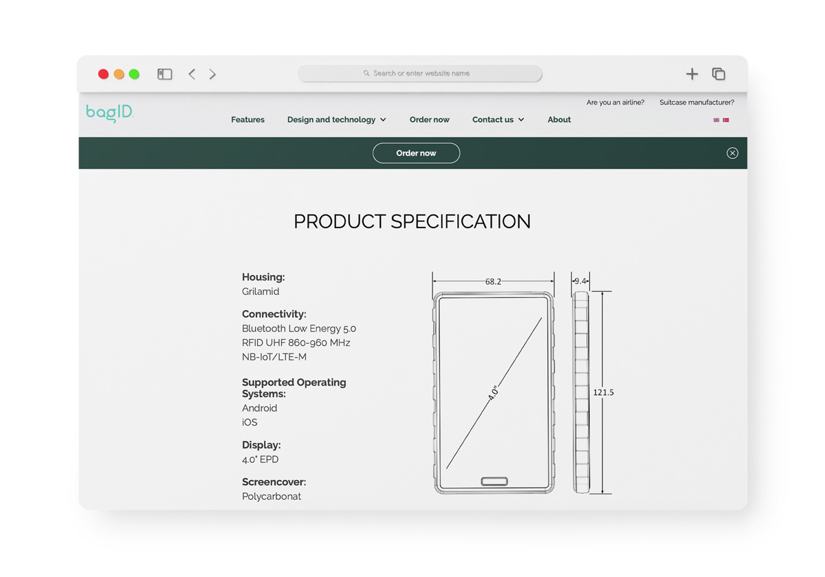
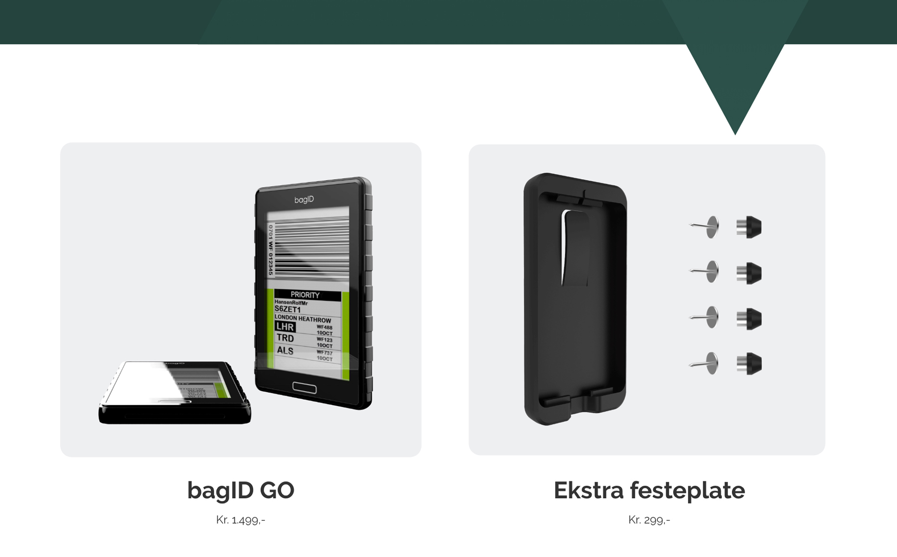
They wished to see more images of the product to get an idea of how it worked and how big it was.
"I didn't quite understand what this was. I know it is written here, but... What does it actually do?"
"It seems like they think it is obvious how this device is used, and I’m just supposed to understand it. The shop looks like it was created for people who already know the product specifications."
"I don’t feel like this website explains why I should use this product".
The New Website
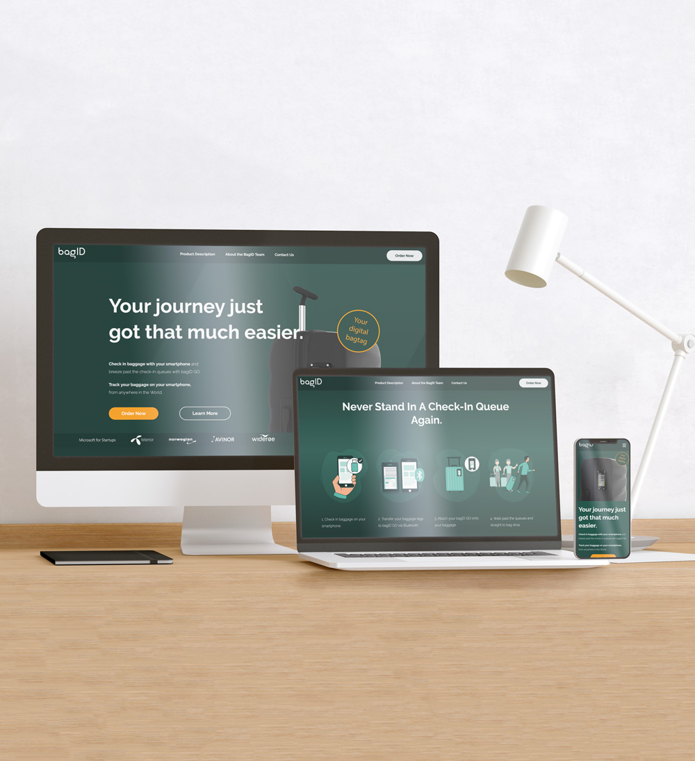
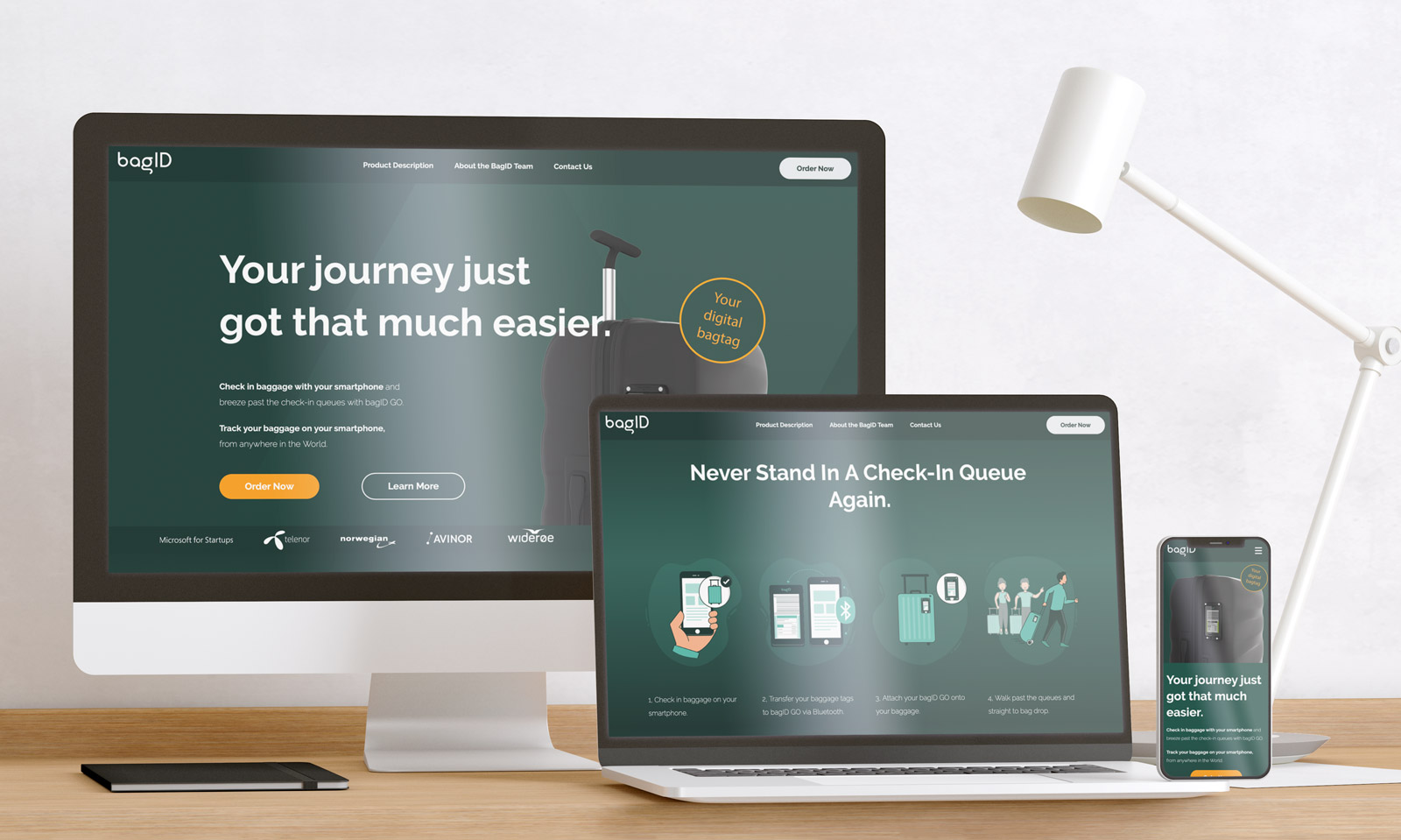
With all the information acquired from traffic analysis, interviews with frequent travelers, and contextual inquiries, I built this new website for BagID:
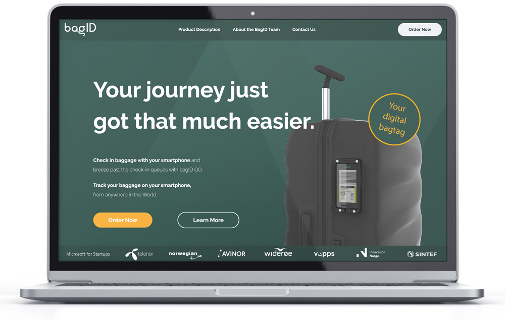
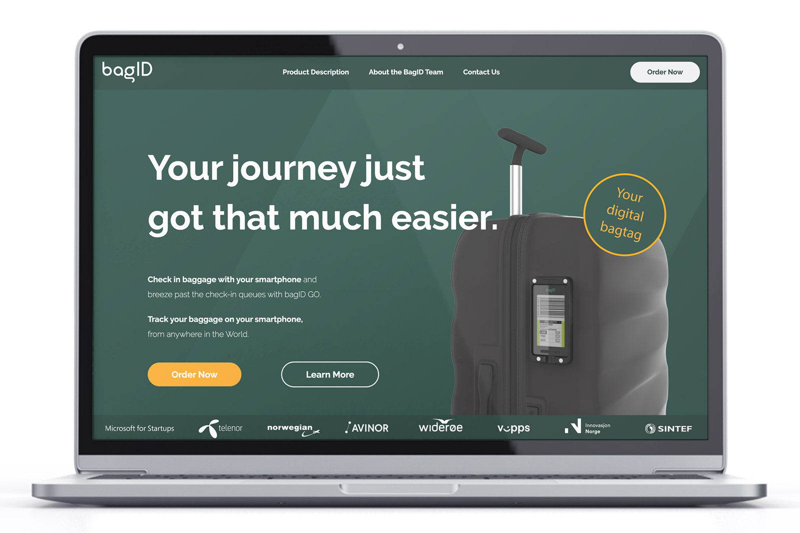
Explaining the Product - What, How, Why?
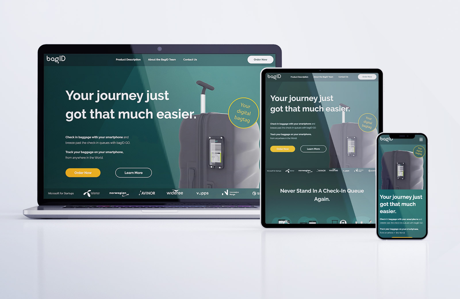
Through the headline, image, and stamp, the website immediately tells the user that this is a digital bag tag that you put on your suitcase, and it makes your travel easier.
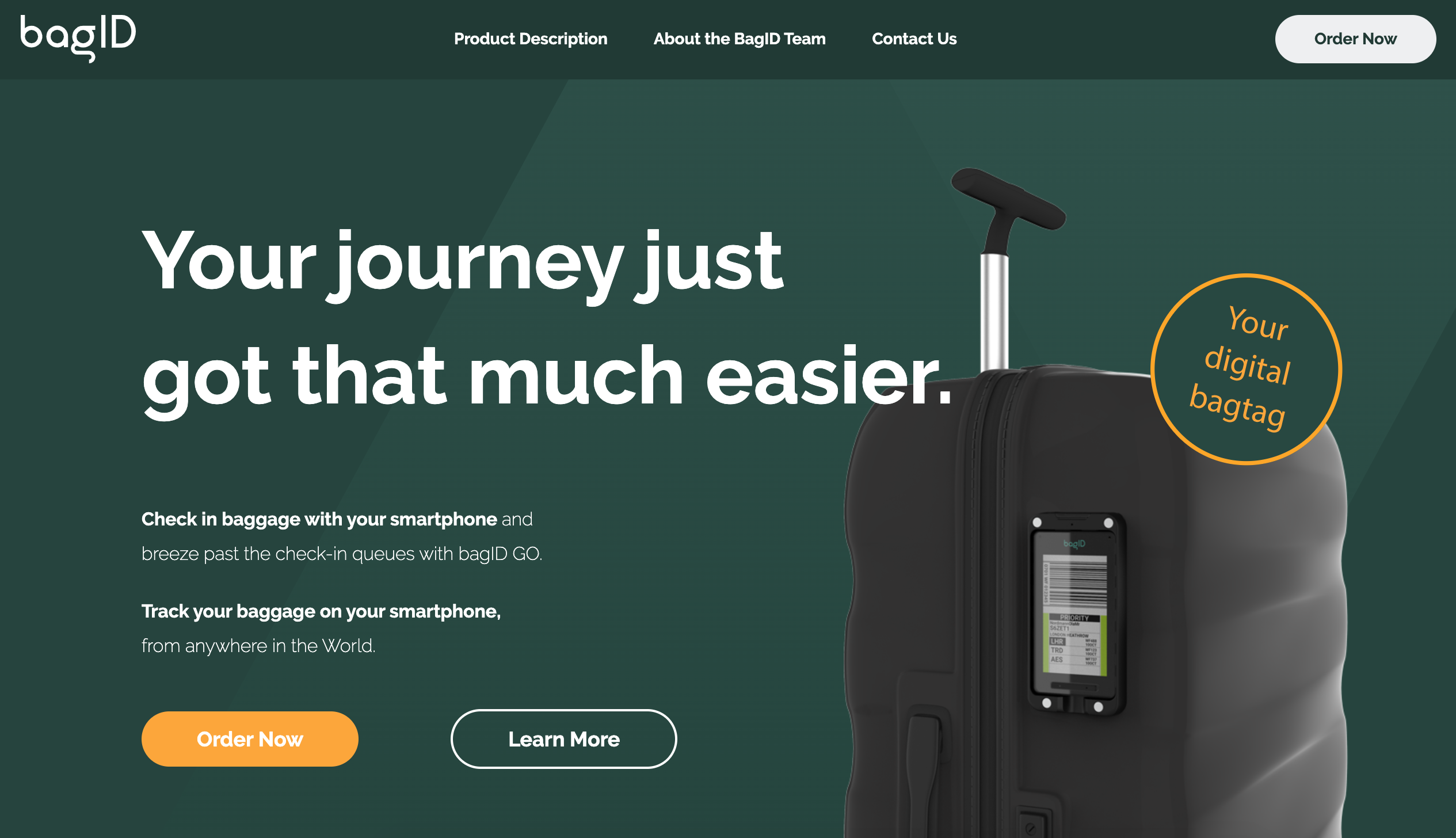
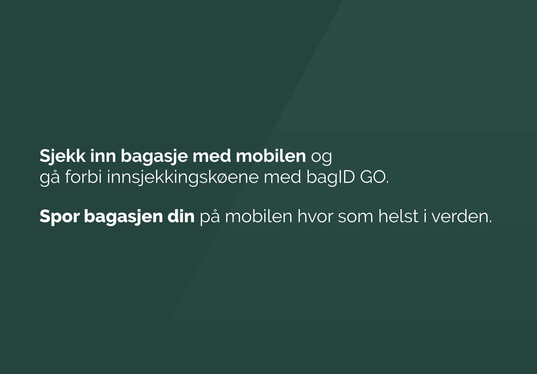
Reading the text snippet, the user is also informed about the check-in and tracking opportunities.
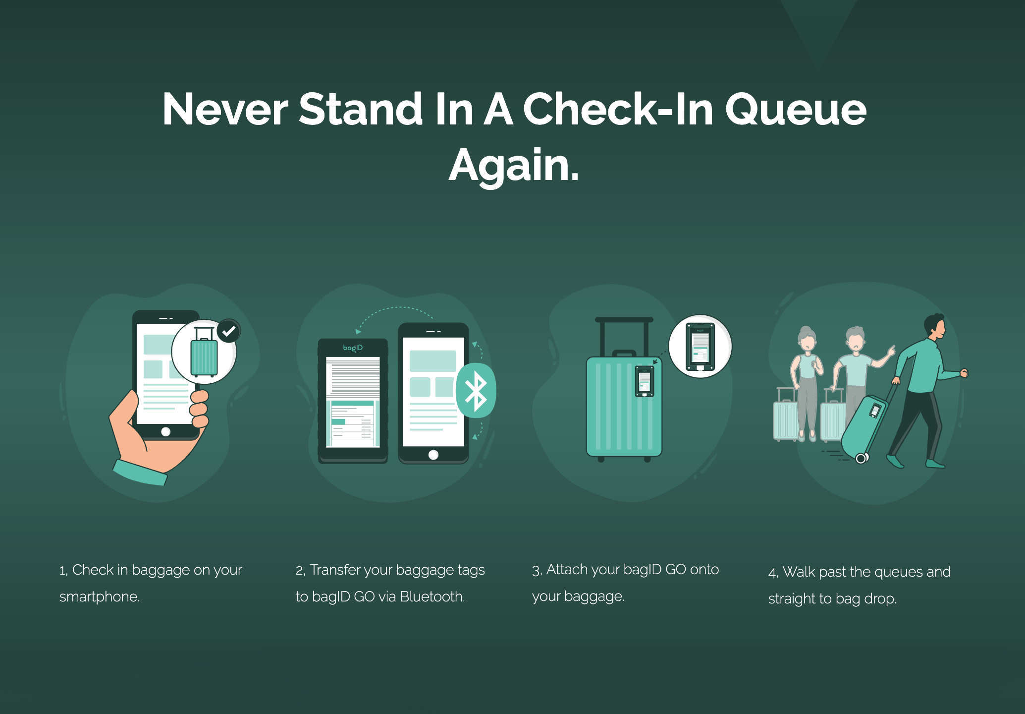
Scrolling down, the user can see how to use the product and how easy it is.
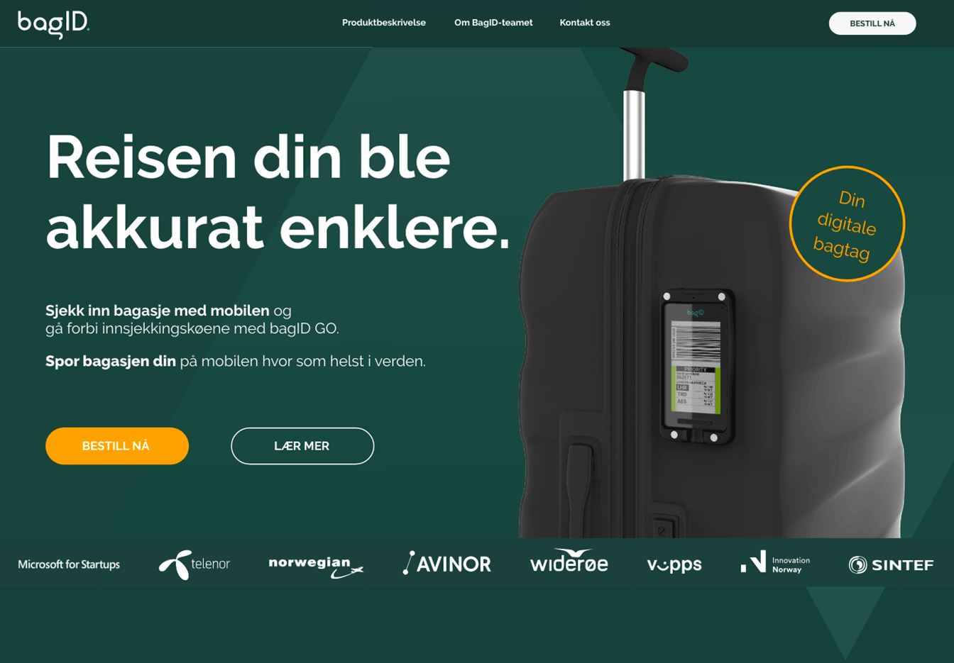
They also get to see the list of trusted partners supporting the product.
The website has now explained what the product is, how it is used, and why the user needs the product. The information is conveyed in a non-technical way, and the product seems easy to use.
Answering Users’ Questions
I wrote a new Product Description page, including all questions asked during the research. The previous product description was rewritten and included.
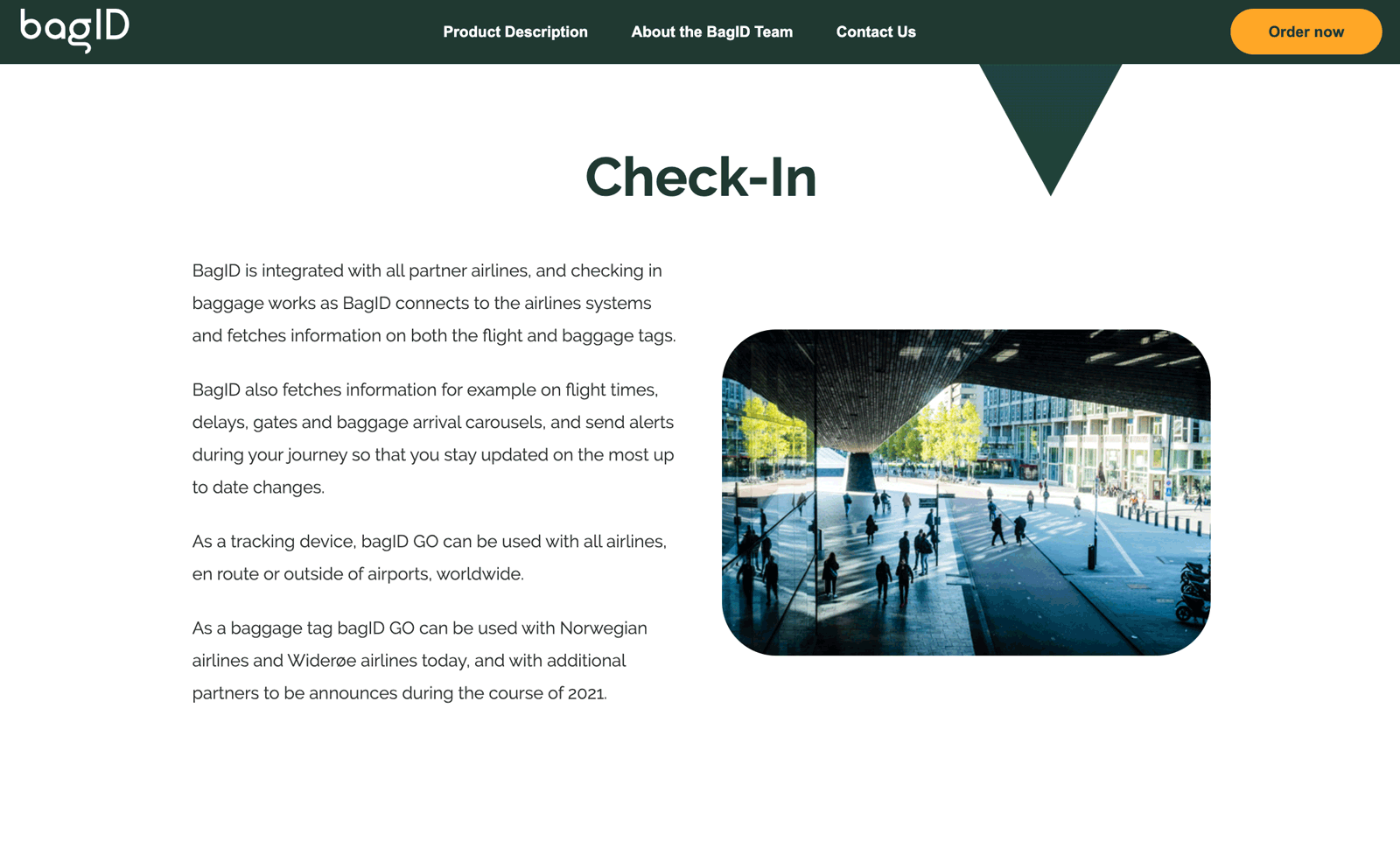
The language I used was easy and conversational, and complicated formulations and technical terms were avoided, to make sure this information could be consumed by anyone.
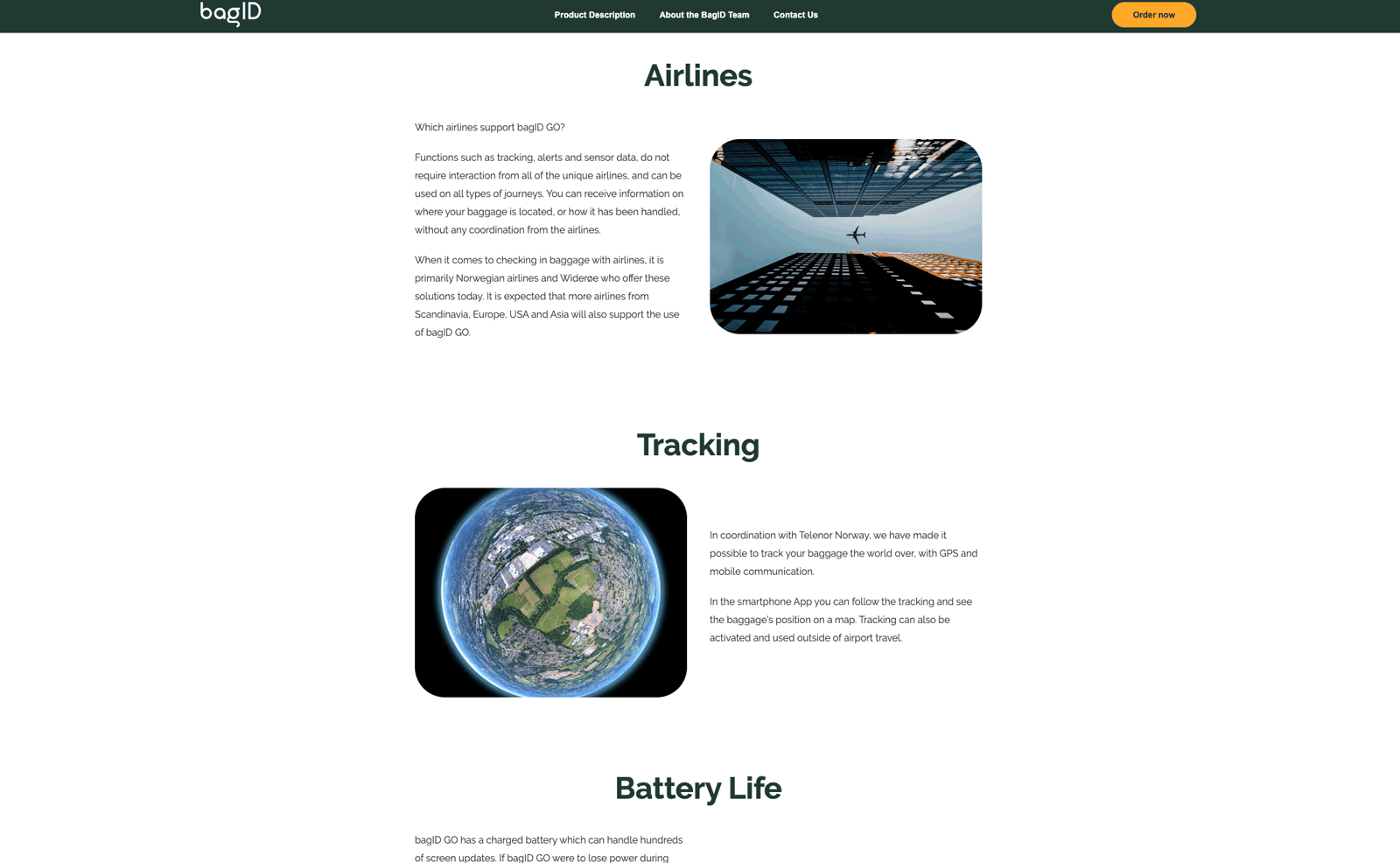
Based on the test users’ behavior when looking for answers to their questions, I constructed the Product Description page. It has big headlines, whitespace, and supporting images, making it easy to skim through.
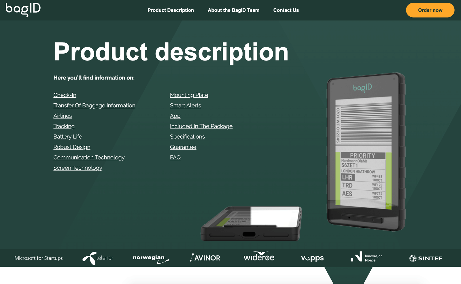
I included a menu in the header allowing the user to quickly get an overview of the page’s content and jump directly to the desired information.
Inspiring the User
The website needed to inspire the users, make them fantasize about traveling and picture themselves traveling with a bag tag.
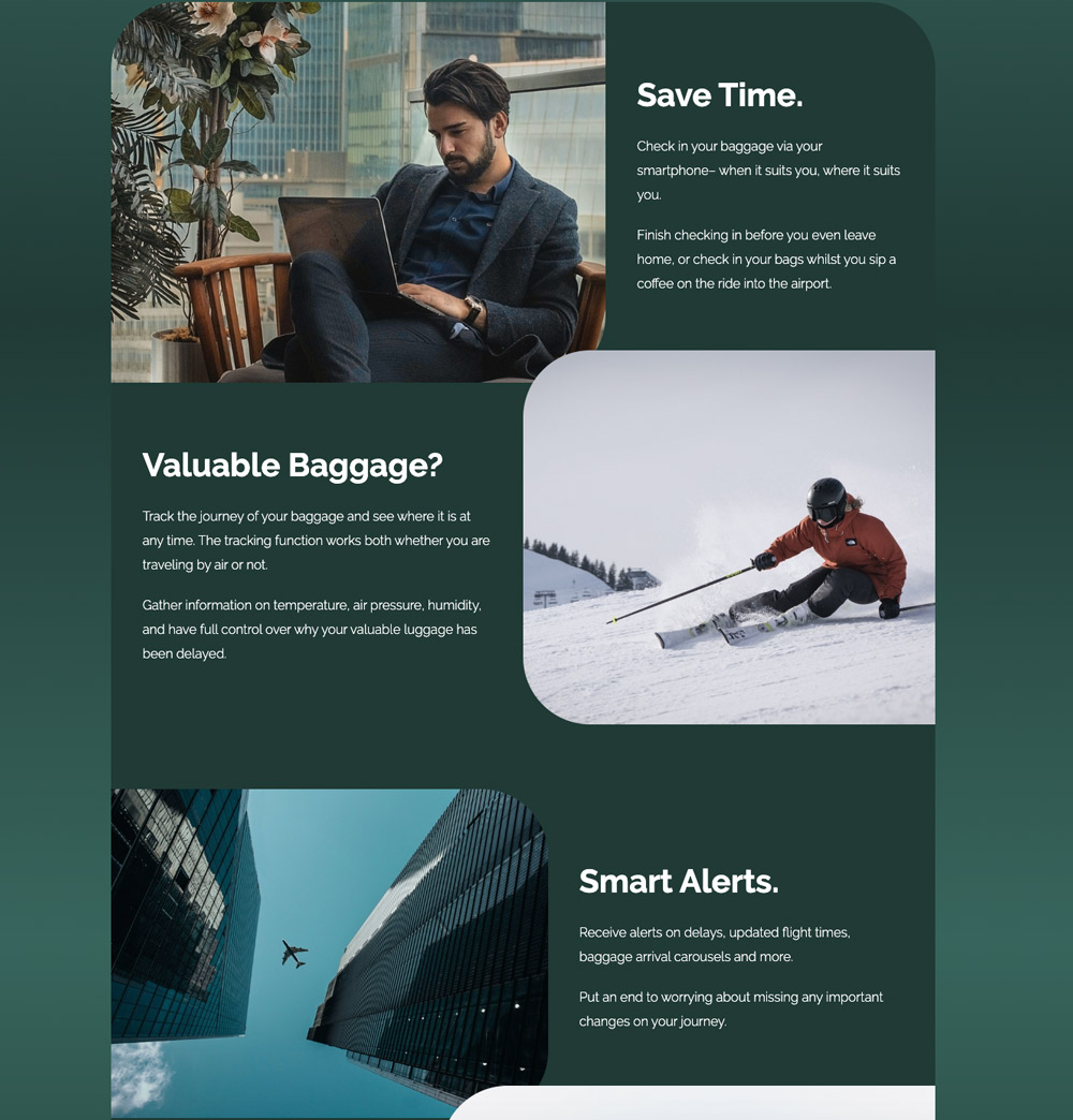
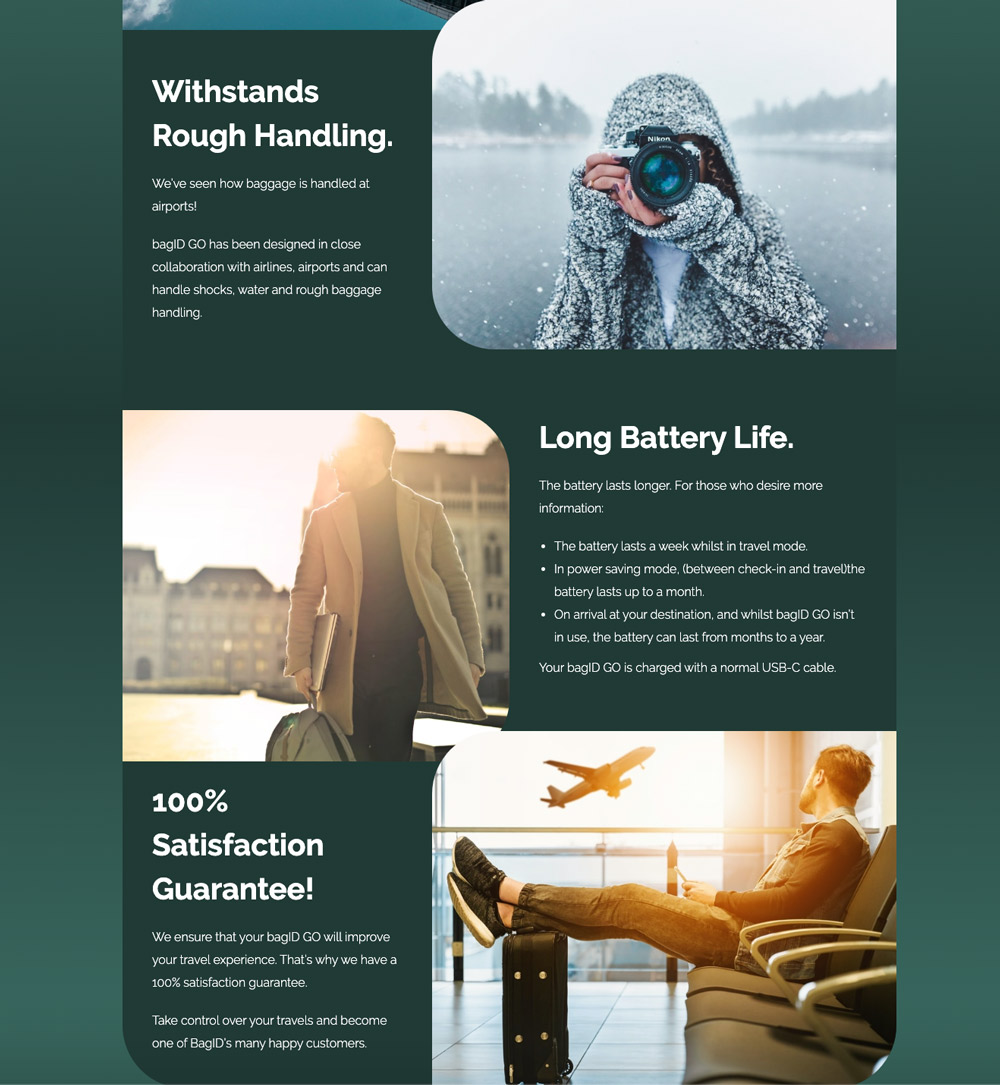
I added an accent color to their previous color palette and used gradients of the dark green to soften up their look. The new design is warmer, more inviting, and it makes the product seem less complicated.
The imagery includes people that look like the target audience, traveling in a stress-free way.
Mixed with inspirational and calm travel photos, the imagery tells a story about how easy traveling will be with a BagID bag tag.
It also shows what kind of people would typically use a bag tag.


This design allows the user to recognize themselves and fantasize about being in the situations portrayed.
Technical details
This website was built in Webflow. The administrators wanted an easy-to-use backend, so I moved their shop to Shopify and integrated it with Webflow.
The products are displayed on the website with JavaScript, and the website uses Shopify’s checkout interface.
Responsive
The website is responsive and can be used on any device.
Result
We saw an immediate spike in sales upon release, and BagID went on to close a 1,5 mil USD round in Folkeinvest, showing great public interest.
Visit Website
Due to a change of platform, this website is no longer active. It can still be seen in Wayback Machine’s archive.
Other Projects
Let’s Connect
I’d love to hear from you!
Give me a quick call, and we’ll grab a ☕ - IRL or on a video call.
+47 92 69 85 66
lis.uhlen@gmail.com
