Mars Mag - Extensive User Testing
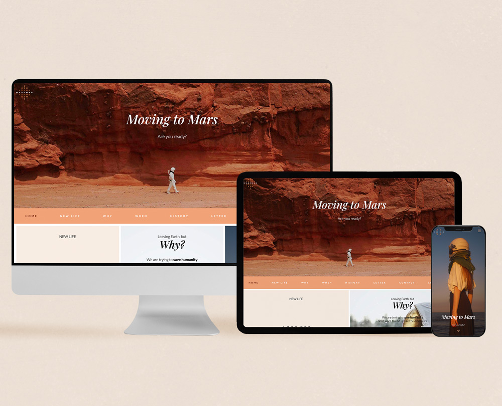
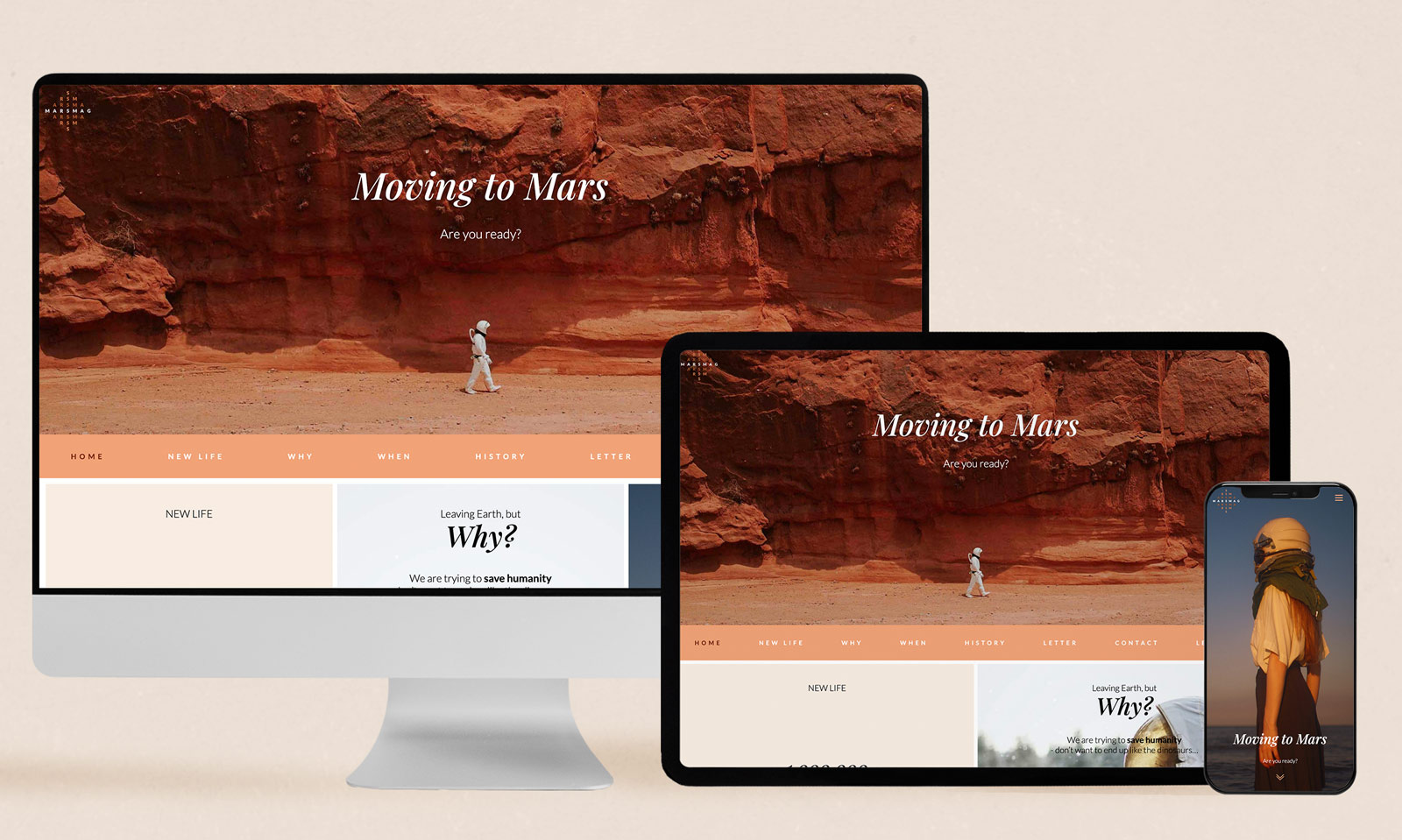
I built an editorial microsite for SpaceX with the goal of raising awareness about space program activity, with women 25-35 as my target audience.
It contains information from a NASA open API and has a history section that can be filtered in several ways.
This project required extensive user testing.
The Challenge to Solve
To raise awareness, I wanted to reach new audiences. I don’t typically hear the target audience discuss space technology, and I wanted to find out why and try to change it.
Several user interviews revealed three main reasons the target audience is less informed about space technology than they want.
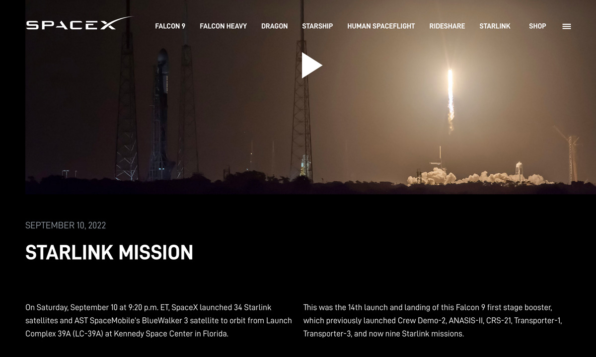
Challenge 1: Information about space technology is often technically advanced and requires too great an effort to understand.
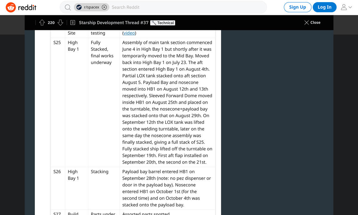
Challenge 2: Space-related information is typically presented in long read formats, and my audience doesn’t have time, or the will, to "sit down and study this wide and complicated field" during their busy days.
Challenge 3: Space information doesn’t appear in their preferred channels: Instagram, Snapchat, and the Norwegian online newspapers.
"I would like to be better informed about the topic, as long as it is tangible".
"I think it’s super exciting that we’re going to Mars, but I don’t care about the facts, I would like to know why! Why are we going, where did the idea come from, and how is it going to happen?
And I would love to see photos, I want to know what it feels like, I want to... I want it to be more emotional! Not just dry facts...".
"If people start discussing space, I just try to seem distracted by something else to hide that I know so little. I would love to know more, but I don’t know how.
I wish a very enthusiastic person could just sit down and tell me everything there is to know about space in an exciting way. That would be amazing!"
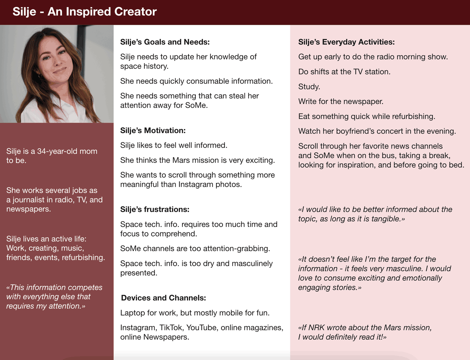
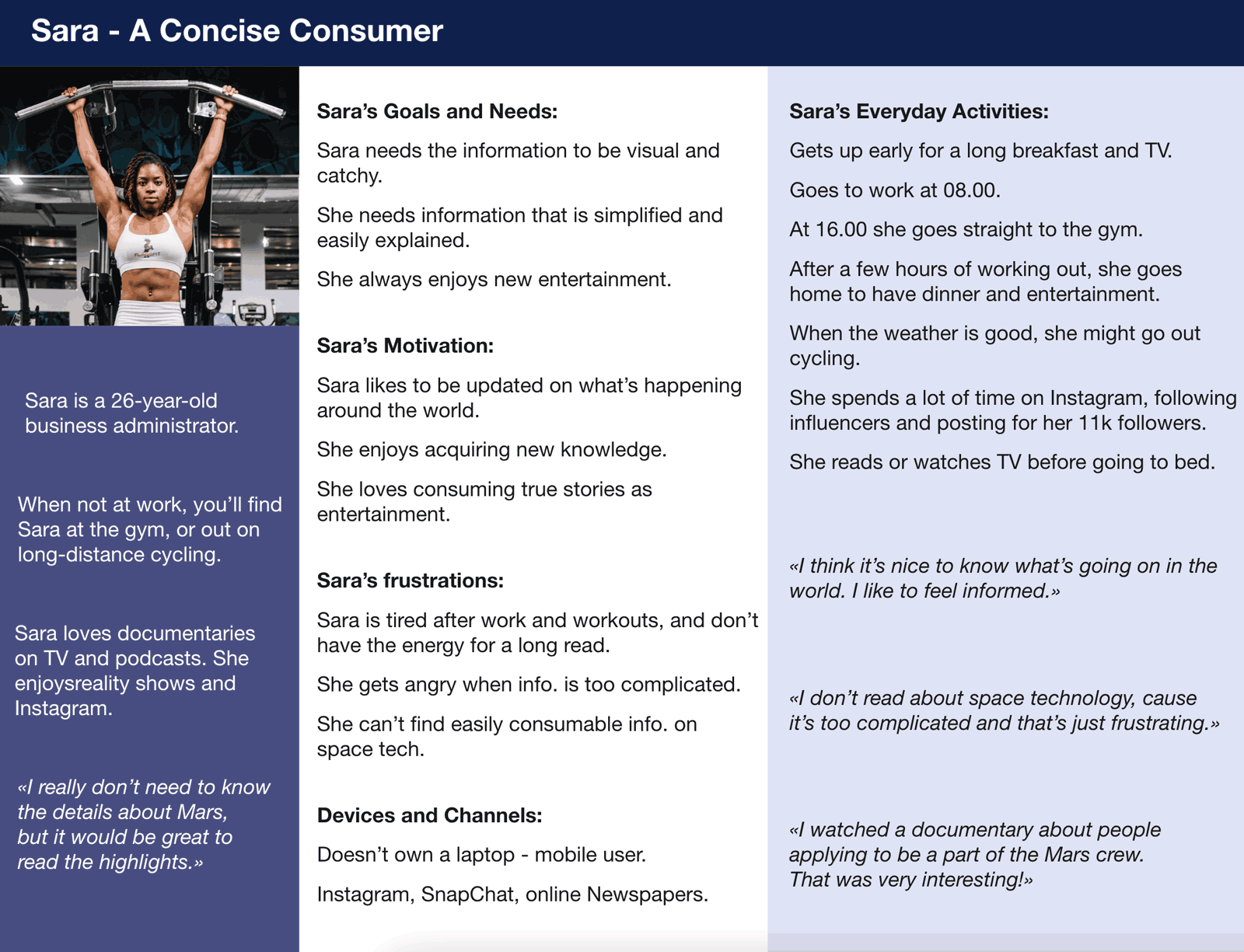
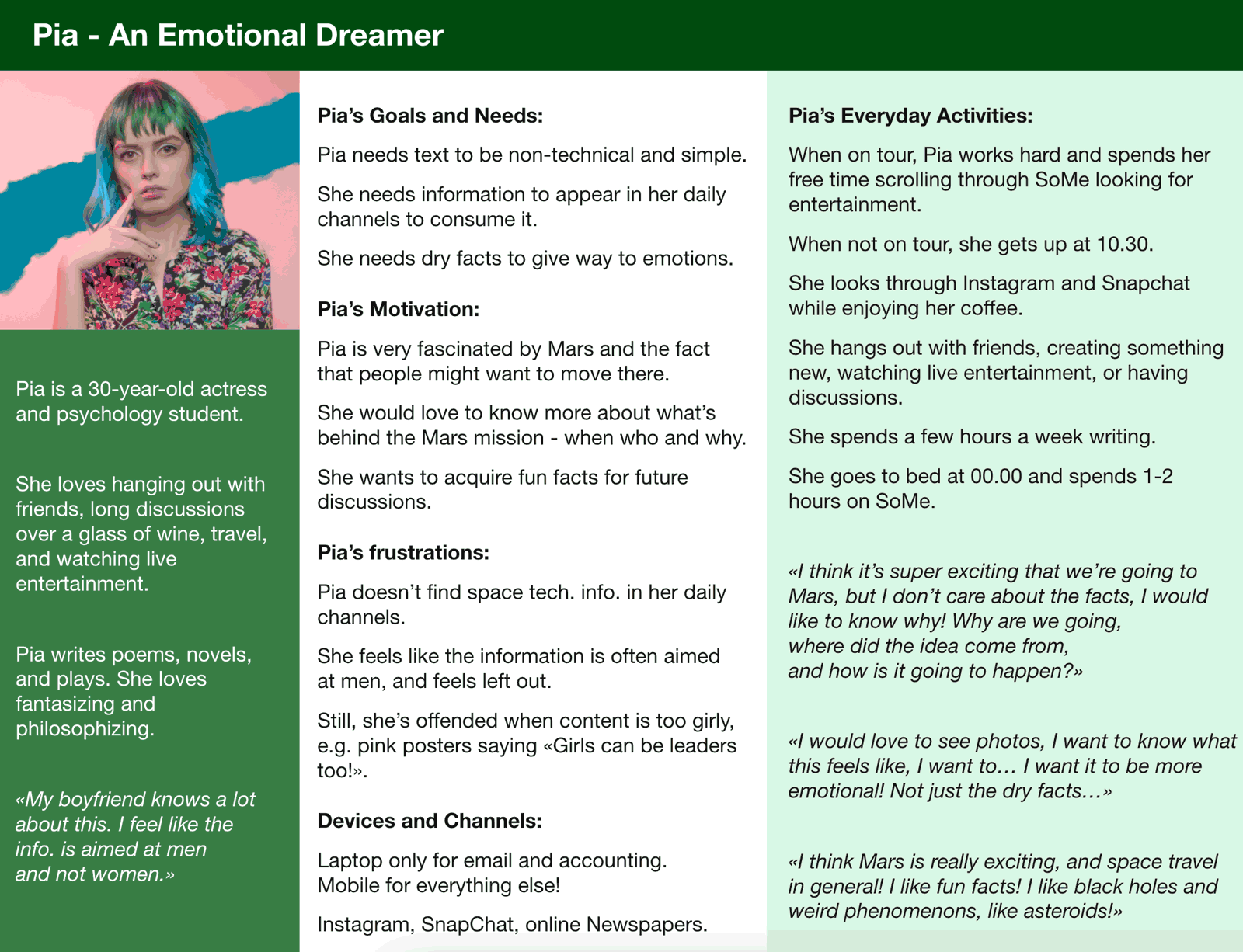
The personas
Based on the interviews I created three personas for this project. Surprisingly, most of my interview objects had the same pain points and similar needs and motivations. The big difference lies in how they consume content.
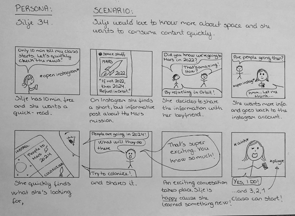
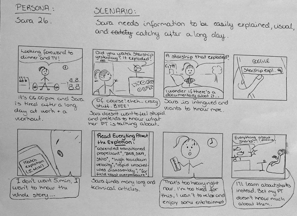
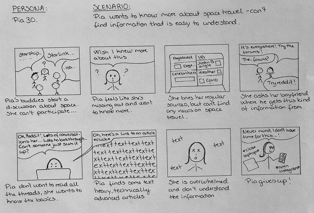
The Storyboards
The storyboards highlight the personas’ most prominent pain points.
Target Audience Research Conclusion
To raise the target audience’s awareness about space program activity, I had to communicate the information in a new way, making it enticing, interesting and engaging to this user group.
Researching Competition
My personas visit Instagram and the Norwegian online newspapers daily. They also use TikTok and Snapchat regularly.
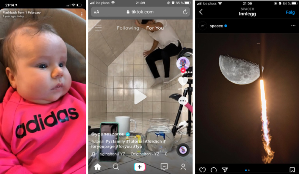
Instagram, TikTok, and Snapchat have visual user experiences. Images and videos cover the whole screen. Text is minimal and often put on top of the image to allow the image maximum size.
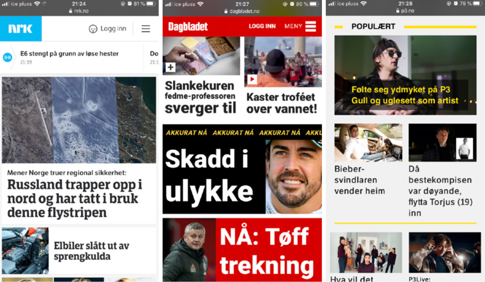
NRK, Dagbladet, and NRK P3 use short, text snippets combined with images and bright colors to create an enticing user experience. There is just enough information for the user to quickly get an overview and get curious.
Contextual Inquiries
I conducted contextual inquiries on five online magazines to find out which amount of text is right, what makes users click, and learn more about which photos, colors, and designs recur across the magazines; these I noted as appealing elements and styles for my target group.
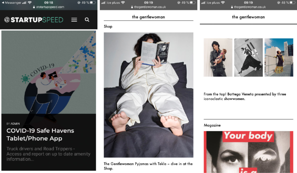
The At Startup Speed website was fun, but not very compelling. The Gentlewoman was cool but too messy, and my users didn’t understand what it wanted to communicate.
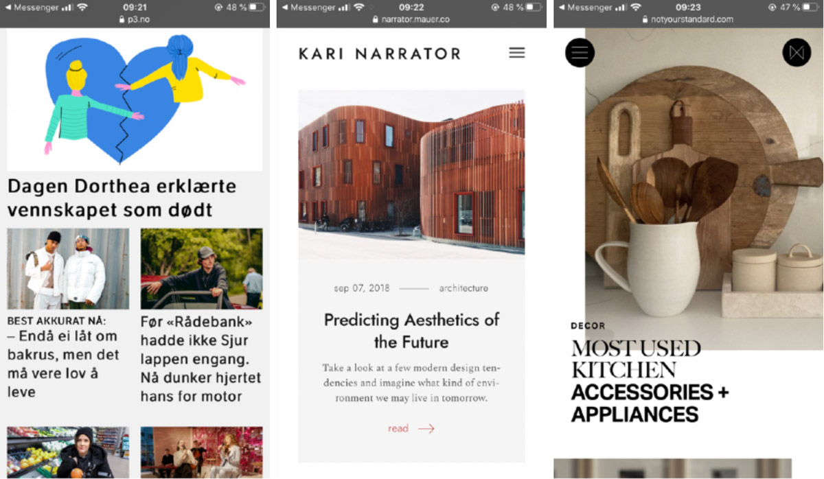
The Kari Narrator website was pleasant, but not very exciting. Many users found the Not Your Standard website aesthetically pleasing, but they didn’t want to consume the content.
Most of the users preferred NRK P3. They found it tidy and consistent with a comfortable amount of text, and they liked the photos.
I had a suspicion my users were influenced by the fact that they were already familiar with this page.
The contextual inquiries taught me I should build something calmer than the At Startup Speed site, clearer than The Gentlewoman, and more lively than the Kari Narrator site.
Maybe something similar to NRK P3, but that needed to be tested more thoroughly.
Researching Inspiration
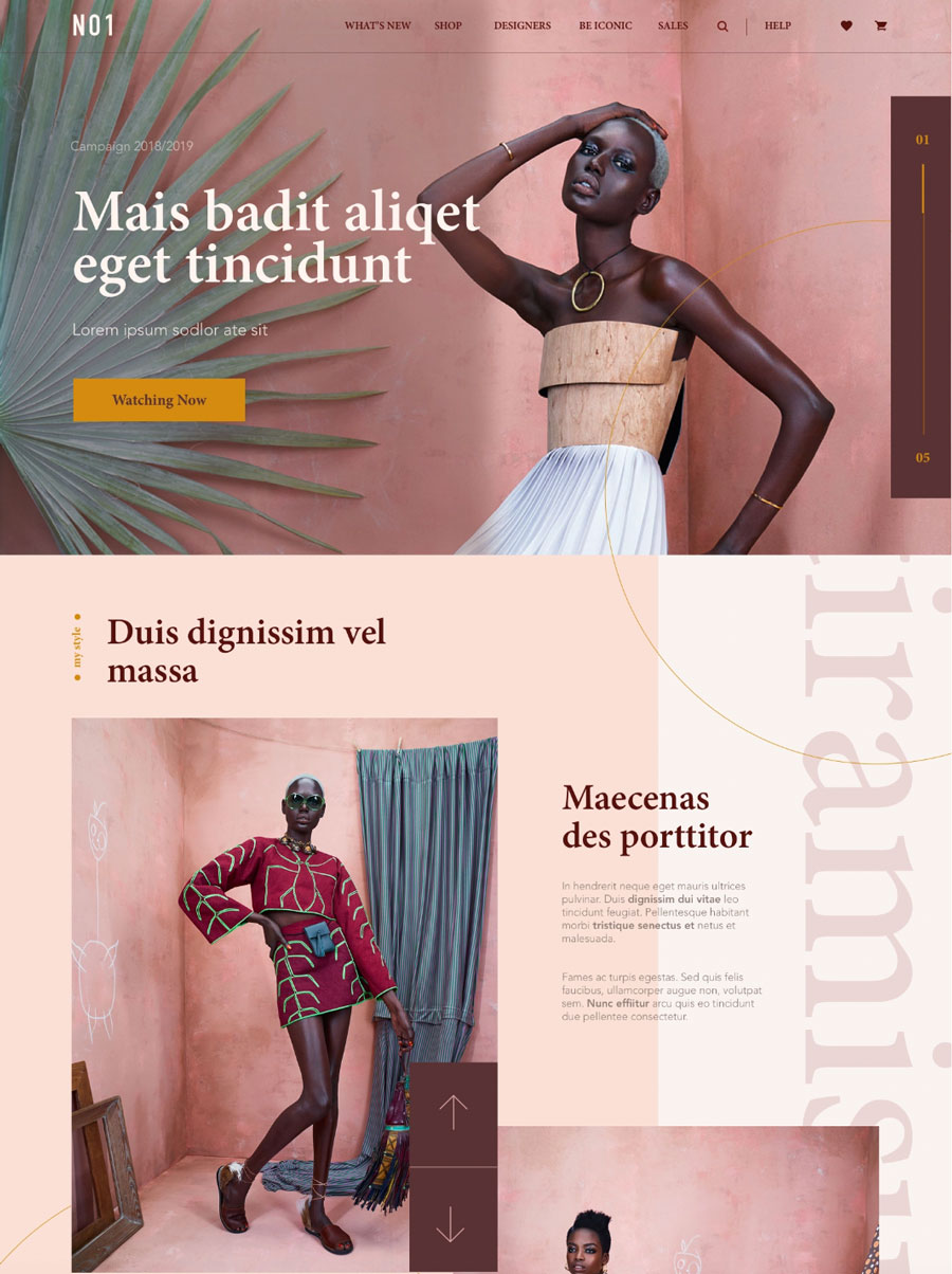
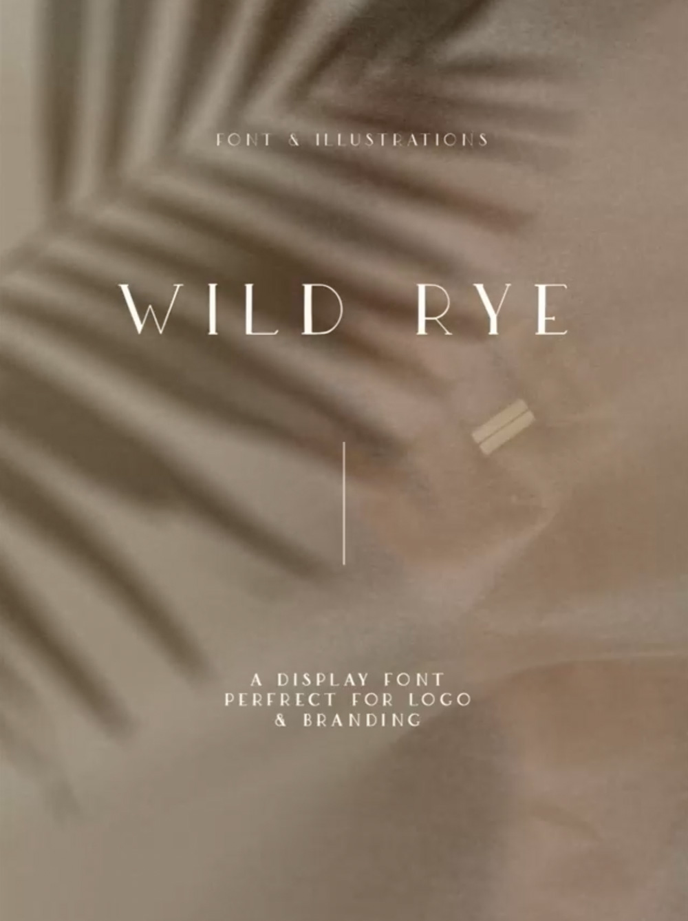
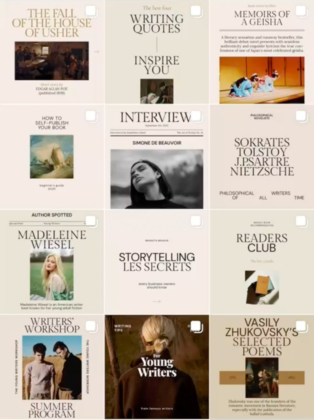
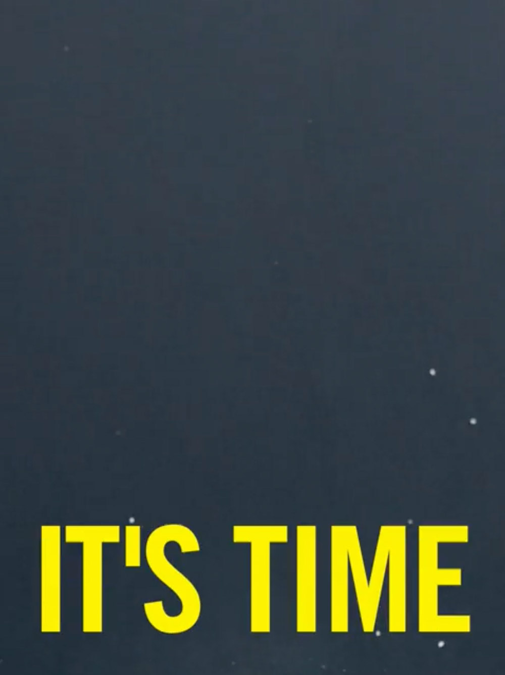
I gathered inspiration for different expressions that I wanted to try for this project:
Typography and images paired with calm colors. More expressive typography, with strong, dramatic color and contrast, and user experiences covering the whole screen, enticing the user to scroll for more content.
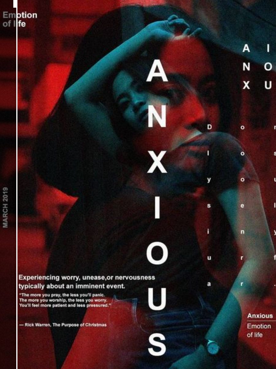
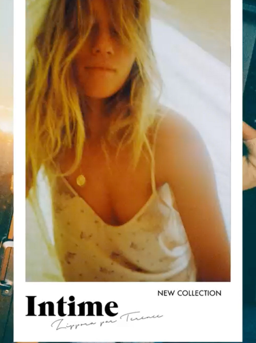
Researching Competition and Inspiration Conclusion
I wanted to create a user experience with many images and short, catchy text snippets that would entice the user into clicking the links.
The website copy should be divided into short paragraphs with several headlines. The most essential sentences should be bolded, making the text easy to skim through.
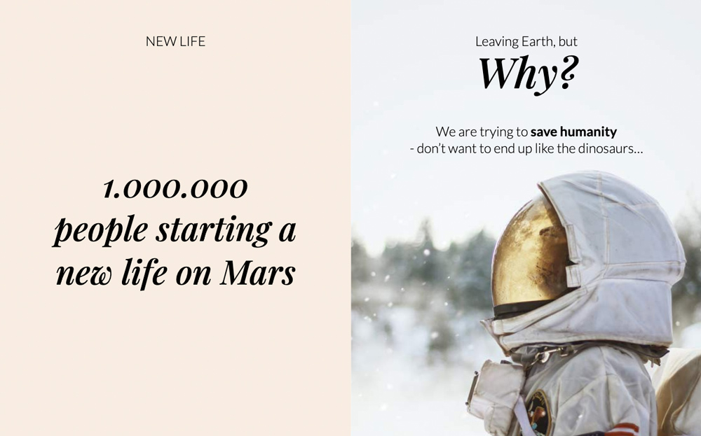
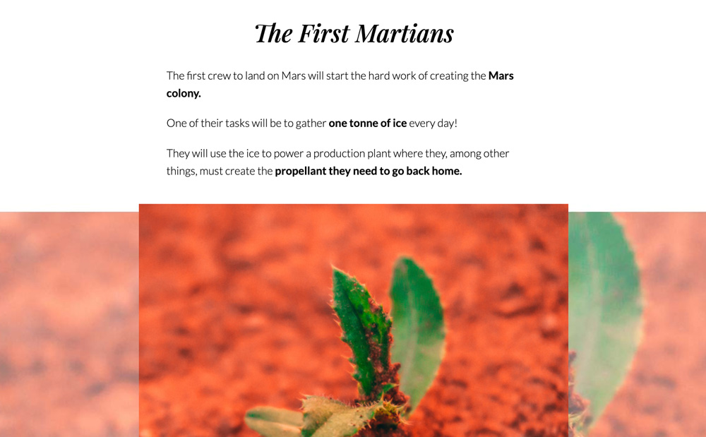
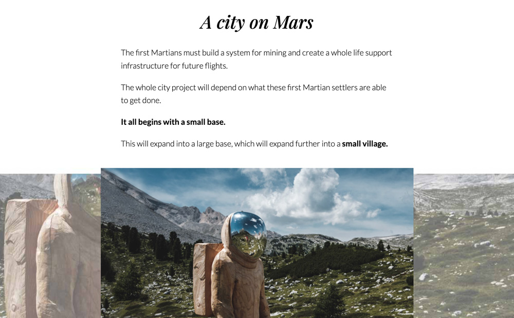
The articles would also contain several images, making the experience more visual, allowing the user to easily imagine what the story looks like, and what it feels like - communicating to the user’s emotions.
Interface design for user testing
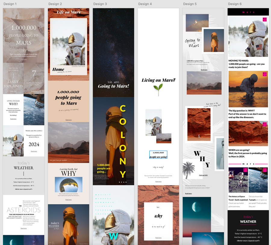
To quickly learn which format the target audience preferred when consuming space-related content, I created six prototypes in Adobe XD for contextual inquiries. They were greatly influenced by the inspirational images.
💡
Surprisingly, my users were not that intrigued by the design based on NRK P3 - the favorite from the last user test (Design 6).
Containing space-related content, this layout wasn’t that appealing - it had too much text, and the design was clean but boring. The users skimmed through it and didn’t click any links.
💡
The users found the playful layouts with lots of text and images to look at, and the minimalistic look, too messy and random (Designs 1, 4, and 5). These layouts made the content harder to consume.
💡
Design 3 was the favorite, as it presented only one theme at the time, allowing it to fill the whole screen and avoiding distractions. The users also loved the colors and imagery of Design 2.
💡
To be completely sure I had understood what appealed to my users, I created two new prototypes. This was also a great way to test headlines and different content ideas for the project.
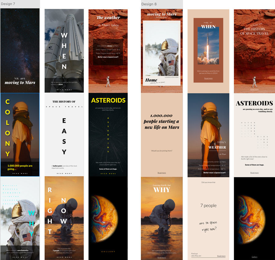
After this round of contextual inquiries, I felt ready to move on and start working on the final design.
Information Arcitechture
The information architecture was based on user interviews. I tested it during the contextual inquiries and had a new set of users perform a card sort to confirm the architecture.
Design Process
I wanted to create a delicate and enticing website that caught the target audience’s attention and kept them on the site to consume the content and communicate space technology in a way I haven’t seen done before.
My users responded best to calm, warm earth tones. They give the design a friendly and comforting feeling, and are a great representation of "the red planet".
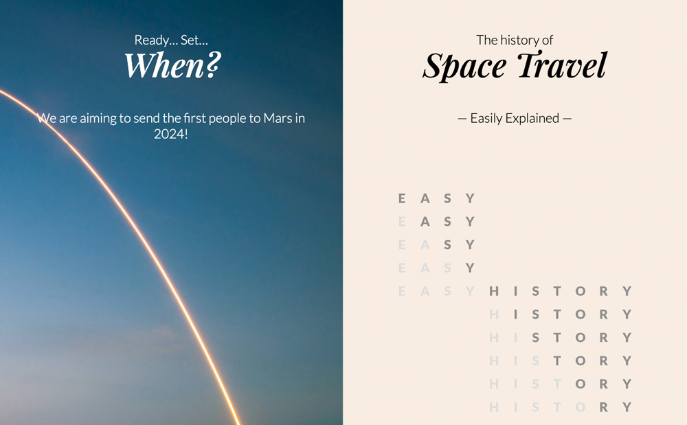
I included blue in the color theme to convey confidence and wisdom, as well as imagination and inspiration. Several images have blue skies and oceans.
Lato was used for the website copy to provide a pleasant and easy reading experience.
The Playfair italic font used in the headlines is elegant, feminine, and a little playful, and it breaks the associations with space technology being complicated and boring.
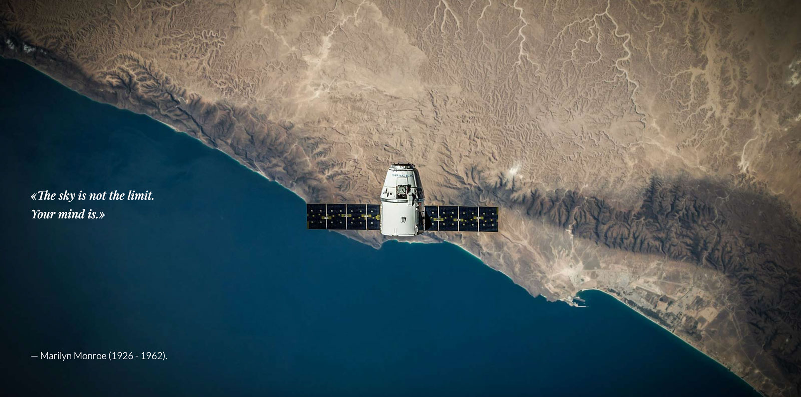
Technical Details
This website is built with HTML, CSS, and JavaScript. It is designed and built mobile-first and is responsive.
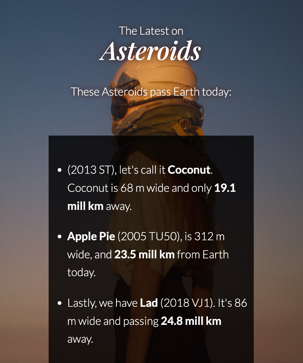
Information on objects passing close to Earth is retrieved from NASA’s Near Earth Object Web Service’s open API.
JavaScript is used to find the three objects closest to Earth on today’s date, and to format the information into readable numbers.
To make it more relatable and fun, I created a random name generator to give the objects puppy names.
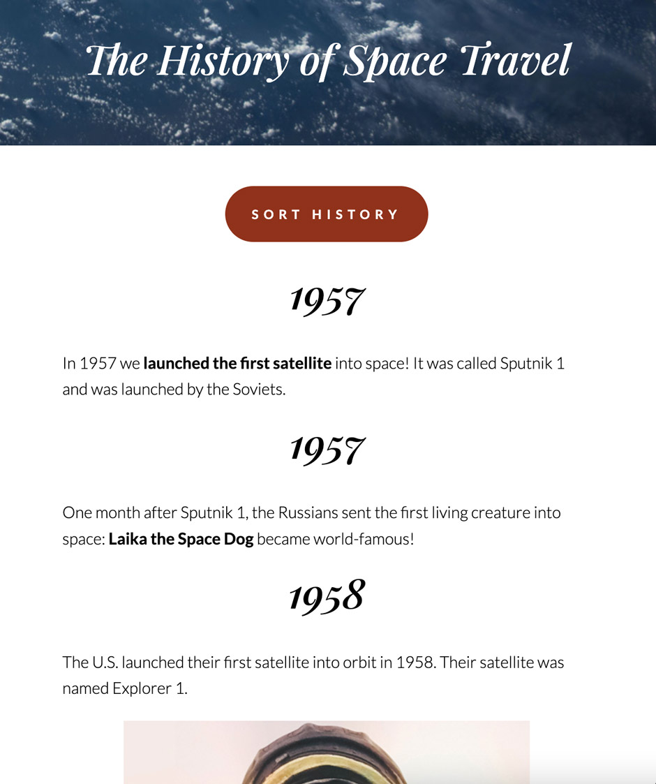
The history can be sorted into a few different categories and by old-new or new-old.
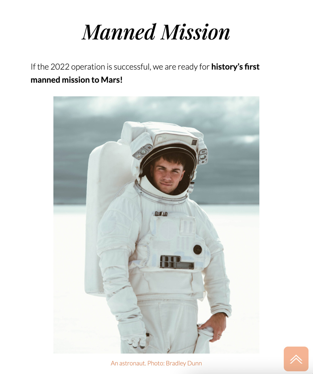
I didn’t want the back-to-top button to clutter the header, which is a decisive part of the user experience. The button appears after 650 pixels are scrolled on mobile and tablets.
Result
I wanted to know if the finished website reached my target audience, and had one of my most skeptical users test it when uploaded.
During the first interview, she said: "It’s just too complicated and far from my everyday life. I think it’s exciting, but I’m not interested enough to read articles about it".
After visiting the finished website, she said: "Will this website be launched for real? [I answered no] What a pity! I want to read these stories. You know what? You should make a website about the stock market as well, ‘cause that’s another thing I really wanna learn about!"
Other Projects
Let’s Connect
I’d love to hear from you!
Give me a quick call, and we’ll grab a ☕ - IRL or on a video call.
+47 92 69 85 66
lis.uhlen@gmail.com
